
Armani Moffatt's Yr 13 Media Blog
Friday 9 March 2012
Thursday 8 March 2012
What have you learnt from you audience feedback?


When getting our audience feedback me and my group each done different surveys but held the focus group together and each asked our digi packs and websites. As you can see from the screen grabs above mostly females watched the music video and also in our focus group there where mostly females this could effect the result we get because males usually have different opinions to females, therefore if we had more males doing the survey and in the focus group we our result may have been very different. Even though there was mostly female answering the question it does help because females are our target audience so their opinion counts the most.


By looking at the survey results everyone that watched the music video enjoyed it, therefore we were very successful when it come to creating a music video which people enjoyed. It was also good to see that people enjoyed the music video for different reasons for example some like it for the effects, another person like the message that was portrayed in the storyline and the final person like the fact that there was always something on screen and that it wasn't boring to watch. From this feed back i have learnt that by putting a in storyline and performance, also by using good editing it is we where able to make people interest from all the different things to look at and simulating their brain. The by looking at the ages of people that done the survey and was in the focus group we know that we was successful when making sure the target age, which was 13-19, enjoyed our music video. Also from looking at the data above i have learnt that people that liked our music video also likes a variety of other music genre, this is good because it shows that we can appeal to a wide range of people.

In the survey we some result that we wasn't expecting, which was that they thought the girls were sexy and boring but the other results we got was what we were looking for. Then in the focus groups they also gave us the results we wanted which was that they thought the girls were normal and casual, from this i also learnt that the girls didn't feel intimidated by the girls because they wasn't extremely sexualised like most girls bands and our band seemed like nice normal girls, people they want to be friends with.

Everyone how done the survey said they would carry on looking at the website once they went on it, the reasons why is because the video was interesting, because the slideshow at the top encouraged them to have a look around and because the website had engaging colours. This is good because no i have learnt that it is mostly the things that people look at make them more interesting to look at the website rather that the things they have to read. Then in my focus group the everyone also liked the website, the 3 girls said they liked the colours of the website but the one boy said he didn't and would have used different colours. The reason why i think he didn't like the colours was because browns and cream colours are not very appealing to boys and they prefer more bold colours rather than neutral. But they all said it looked easy to navigate and they would carry on looking around on it.

When i come to the CD 100% of the people that took the survey said they would look at the front cover of the CD first. This is good because i made sure i put an image of the artist on the front cover so people straight a way knew who the artist where and what they are called and the name of the album. In the focus group they also like the CD cover but yet again the boy wasn't to keen on the colours.

When it came to asking in the focus group if they thought my website and CD cover link they agreed because they could see a consistent colour scheme though-out and also because the band was both seen on the website and on the CD cover. Then when it come to the survey they mostly agreed that there was a clear link between the website, CD cover and music video, whereas 1 person thought it was neutral. Im guessing that the person that found it neutral could only see images of the band therefore that was the only obvious link seen. From this i have learnt that the audience do take notice on the colour schemes and photo's showing that it would make a difference to how the felt about the website, CD cover and music video if they didn't have a clear link, because they wouldn't have known if they where all promoting the same thing and if they were produced by the same band.
Overall from my audience feedback i have learnt that my group was successful when it come to creating and image of a band that the target audience would like, and also producing a music video that people would enjoy. I have also learnt that the audience do take notice when it comes to looking at website's and CD covers, and are very aware of what they do and what they like.
Wednesday 7 March 2012
Preparation for Focus group
First of all we will show then our music video and then ask:
Then we will each so them our digi pak's and ask:
Finally we will each so them our website's and ask:
- What do you think about the music video?
- What do you think the concept is behind the video?
- Was the music video suitable for the song?
- What do you think can be improved?
Then we will each so them our digi pak's and ask:
- What do you think about the digi pak?
- Does it relate to the music video?
- Do you find the look of the digi pak appealing?
- What do you think can be improved?
Finally we will each so them our website's and ask:
- What do you think about the website?
- Does it look easy to navigate?
- Does it relate to the digi pak and music video?
- Does it look appealing?
- What do you think can be improved?
Wednesday 29 February 2012
Friday 24 February 2012
Wednesday 22 February 2012
Blog Update 22.02.12
Today me and my group worked together to create some questions for an 'audience feedback survey' this will help us when it come to answering the question about what have we learnt from our audience feedback.


Below is the questionnaire which me and my group created, once you have had a chance to look a the website homepage, the CD cover and the music video could you please fill out the questionnaire below:
Website home page:


CD cover:

Music Video:
Below is the questionnaire which me and my group created, once you have had a chance to look a the website homepage, the CD cover and the music video could you please fill out the questionnaire below:
Create your free online surveys with SurveyMonkey, the world's leading questionnaire tool.
Thursday 9 February 2012
Music video Editing
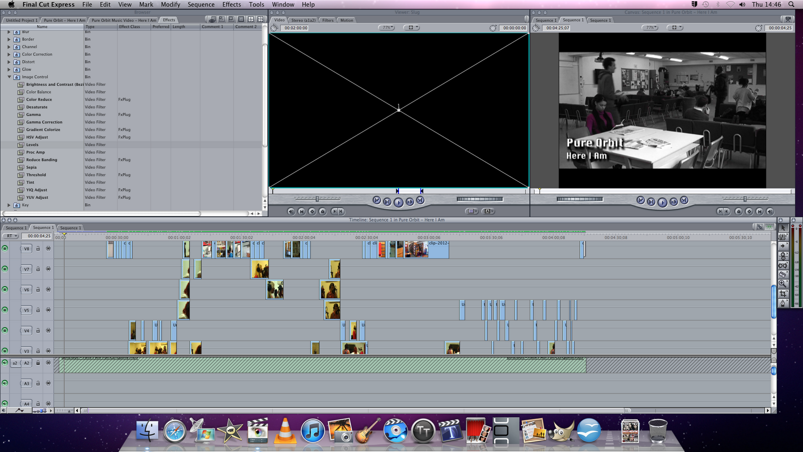
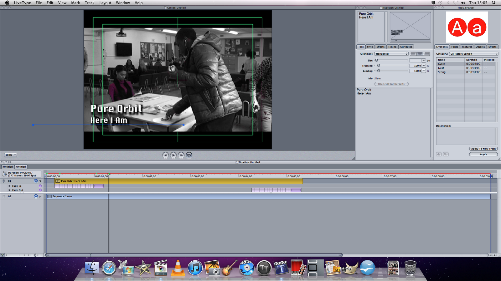
Here is a screen shot of our music video in final cut, most of the clips are all on different timelines so you are unable to see all the clips in this screen shot. When editing this in the storyline we used chroma key, this was so she was the only person who had a bit of colour so that in the video she stands out but in the storyline she is ignored. I found out how to use chroma key by using youtube, so i was able to see how to use it and then apply it to my work. Then when it come to the performance parts we had to use colour correction so that the were similar colours because some of the clips were very yellow compared to others. We also used live type to create the title of the song and name of the artist onto the clip so that when it is played people are aware of who it is by and what the song is.
Here is the video that helped me to use chroma key, but they call it the sin city effect.
Her is a screen shot from live type, for when we created the titles.
Friday 27 January 2012
Adding Production Company Logo to Website and Digipak


This is my digipak which i have now also but the production company logo on. It is on the back of the digipak cover, like the website, about the copyright.
Production Company Logo
The name of the production company which i have decided on was S.A.D, which stands for Sean, Armani and David but it also stands for singing, acting and dancing. Which relates back to the band 'Pure Orbit' because the production company signed them because they are able to sing, act and dance, which makes them so perfect as a band.
Knowing that one of S.A.D's meanings are singing, acting and dancing i have decided to make sure pictures of theses things are incorporated into the production company logo. Therefore there would be a microphone, the happy and sad theatrical masks, and a pair of ballet shoes.

Knowing that one of S.A.D's meanings are singing, acting and dancing i have decided to make sure pictures of theses things are incorporated into the production company logo. Therefore there would be a microphone, the happy and sad theatrical masks, and a pair of ballet shoes.

This is my end result, i decided to go for black white and grey because it looks more professional and sophisticated. On the lettering 'S' 'A' 'D' on each of them i done the same letter but made it a lighter colour and put it slightly off-set so it looks a bit like a shadow on the writing. I also used an effect in gimp which is on filters then on artistic and it is called photocopy, this gave the images a more cartoony look which what i was trying to aim for.
Website update
When i got my teacher to look at my work to help me improve it, we both realised that on my website you was unable to see the writing on the sideshow underneath the banner. Then keeping with the theme of the website we then put a brown box behind the slide show so that the audience are able to see what is says on the slide show. Hopefully this will attract the audience because they can see that there are more pages therefore will be interested to see what more pictures are available to look at.


Blog Update 27.01.2012
Today we had to change our whole storyline because we were unable to get the actor and actress's we needed, due to the fact that most of them were in exams or where unable to make it on the days that we had set to film. We where able to get all of our filming done today so now we are able to carry on with our editing.
Here are some pictures of us filming:
New Storyboard
We decided to do different storyboards for each situation that is ignored. Therefore when it comes to editing we could put the scene's in any order because they are all different situations but the same thing happen's in each one, which is her getting ignored.
Bathroom storyboard

Cafe Storyboard

Classroom Storyboard

Library Storyboard

New Storyline
We encountered some difficulties when it come to trying to film our old storyline because with the amount of actors we needed not everyone was free round at the same time so it was difficult for us to find a date when to film. Therefore we decided to come up with a new storyline so that we wouldn't need as many actor but still has the same sort of meaning as our old storyline.
New Story line
Our new storyline idea was of a girl that in school gets ignored, not only by her peers but also by the teachers and other people. The first scene will be when she goes to the cafe in the morning to buy something but the cafe lady completely ignores her and serves another customer. Then she is in her class room asking for help from her teacher, but her teacher completely ignores her and goes and helps another student. Then the girls is left on her own and turns back to the computer and writes 'invisible'. We then go to a scene where she goes to the bath room and looks at herself in the mirror and doesn't see her refection, yet again showing she is invisible, then she looks at the mirror confused and then walks back out again. Then finally she walks into the common room and sits down and she is sitting on her own while everyone else is doing there own thing and not even taking notice of her.
Like the old storyline this will be intertwined in with the performance in the studio, so you will see the girls preforming then you will see in between the storyline of the girl that is 'invisible'.
Wednesday 25 January 2012
Finished Digipak
Here is my final design for my digipak and i created it using gimp. This is my first design idea that i had and overall i think it works quite well because i have made sure i have used the same colours scheme as my website and banner so people are aware that it is all from the same band. I also i did only have 4 track in the beginning but then realised it had to be an album so i added a few more track names and gave it and album name, which is 'Save The World'.


Friday 20 January 2012
Design For Digipak


This is my second design and on the front cover i am going to have a picture of the girls singing at the bottom and the logo at the top, with the name of the band going diagonally down. Then on the back cover i am going to have a picture of the girls going along the top then underneath i am going to have the names of the songs then in the bottom left corner will be the barcode and to the right of it will be the copyright. On the inside cover where the CD will go i am going to have i 'pure' then a picture of one of the girls then 'orbit' and underneath will be a picture of one of the girls then the logo and then another picture of one of the girls. Then on the final inside panel i am going to have the a picture girls in the studio.
Wednesday 18 January 2012
Website
Here is my website, the only things that i need to add on to make it finished it my digi pack image and also the final music video.
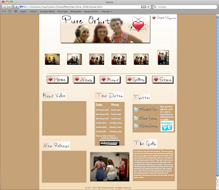


As you can see there is a space for the music video to be inserted and the digi pack image. The video will be placed in the brown box underneath the music video title, and the digi pack image will go in the brown box underneath the new release title.

This is the rest of my website and at the bottom it has some writing about the copy right and terms and conditions, and i have working link to go to each of the pages. Also the 'ticketmaster' and 'twitter' image are also links to them pages, and there are real website.

Also my links work but they lead to a 'site under construction' page, showing they i have made working links but there is no content on any of the pages.
Friday 6 January 2012
On Thursday, 6 October 2011 i analysed album covers as well as websites. I found that out of the 4 album covers i analysed 3 of them had their titles at the top of the page where as the other one had it at the bottom, yet even if they were at the top or bottom they are all central. I also found when looking at the album covers all of them had a photo of the girl band as the front cover.
Here is the analysis of the back of the album covers, but i was unable to find the sugababe back album covers so i missed it out.
Analysis Of Back Of Album Covers
As you can see all of the back of the album covers have barcodes, names and numbers of the songs on album, and information about copyright and record companies involved. These are the 3 things that i will defiantly involve in my work when i start to create my own album cover for my band. Out of the 3 album covers 2 of the have there songs written in paragraph form, where are the other has it in the more traditional form of a list and also 2 out of the 3 have photo's of the band on the back where as one of them doesn't have a photo. The all have the numbers of the track a different colour to the name of the track therefore i can think of incorporating that in my own work.
Subscribe to:
Posts (Atom)